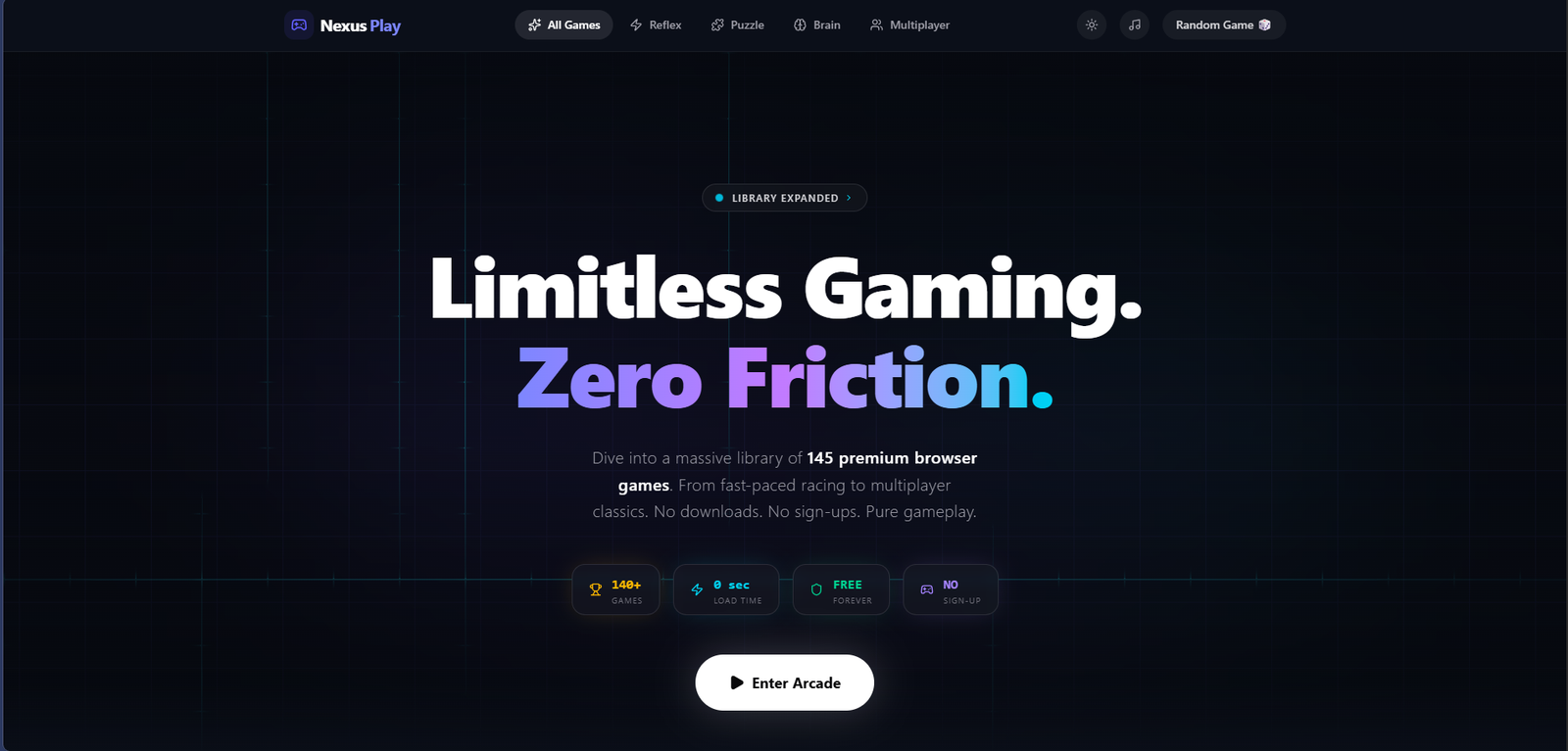
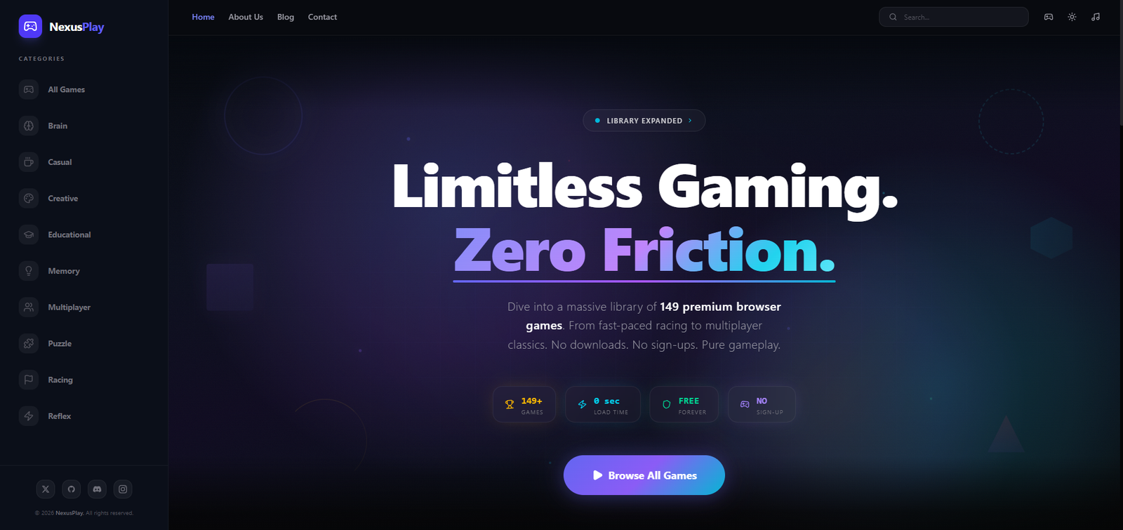
Designing a destination-grade gaming platform that turns fragmented browser gaming into a cohesive, immersive, and fast experience — mobile-first, curated, and distraction-free.
01 — The Problem
Browser gaming existed as a scattered wasteland of low-quality portals — overrun by intrusive ads, slow-loading titles, and zero curatorial quality control. Users bounced within seconds, finding nothing worth staying for.
Despite growing demand for instant, no-download gaming — especially on mobile — there was no premium destination that combined quality curation with a truly modern UX.
The market gap was clear: build the Criterion Collection of browser games — a handpicked library wrapped in a dark, immersive, distraction-free experience that respects the player's attention.
By combining smart discovery, mobile-first design, and instant-launch performance, Nexus Play could own a position no competitor had thought to occupy: premium, curated, and built for deep play sessions.
Research Insights
02 — User Research
Understanding who we design for — their motivations, goals, and pain points.
03 — Business Challenges
The platform problems preventing Nexus Play from retaining and growing its player base.
70% of users on competing platforms couldn't find a relevant game in under 30 seconds. Poor taxonomy and zero personalisation mean users give up before they ever play.
Slow-loading games on mobile networks kill the impulse to play. Every second of load time increases the probability of abandonment exponentially.
68% of users churn within 3 sessions largely due to intrusive ads. Balancing revenue requirements with a distraction-free experience is the platform's central tension.
Without social features, leaderboards, or personalised recommendations, there is no hook to bring casual players back after their first session ends.
04 — Secondary Research
05 — User Stories
06 — Competitor Analysis
| Feature | Poki | CrazyGames | Miniclip | Nexus Play |
|---|---|---|---|---|
| No-Download Play | ✓ | ✓ | ~ | ✓ |
| Game Discovery | ~ | ~ | ✕ | ✓ |
| Performance | ~ | ✓ | ~ | ✓ |
| Social Features | ✕ | ✕ | ~ | ✓ |
| Premium Library | ~ | ~ | ✕ | ✓ |
| Cross-device | ✓ | ✓ | ~ | ✓ |
07 — User Flow
08 — Toolkits
The tools and methods used throughout the design process.
02 — Process
A five-phase design process that moved from competitive audit and user research through to a scalable component library — always anchored to the core tension of immersion vs. discoverability.
03 — Design
Every design decision was made in service of one goal: getting the user into a game they love, as fast as possible, and keeping them there. Dark surfaces eliminate distraction. Glowing accents guide the eye. Instant-launch removes friction.
Design Highlights
Design System
A cohesive design system built to scale across 145 game entries while maintaining a consistent, premium aesthetic. Every token, typeface, and spacing unit was chosen to serve immersion.
Purple anchors brand identity and interactive states. Cyan is reserved for secondary actions and highlights. Near-black backgrounds establish depth without pure black harshness.
Instrument Serif lends editorial authority to headings. Space Grotesk handles all UI text with technical precision and legibility at small sizes.
Strict 8px base unit governs all padding, margins, and component sizing. The grid creates visual rhythm that reads as intentional and premium — even without users consciously noticing.
04 — Impact
Measured against benchmarks from the competitive landscape, Nexus Play's design outcomes validated every major research hypothesis — from engagement depth to mobile satisfaction.