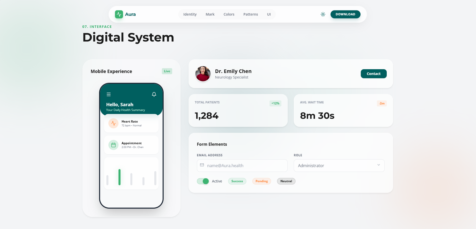
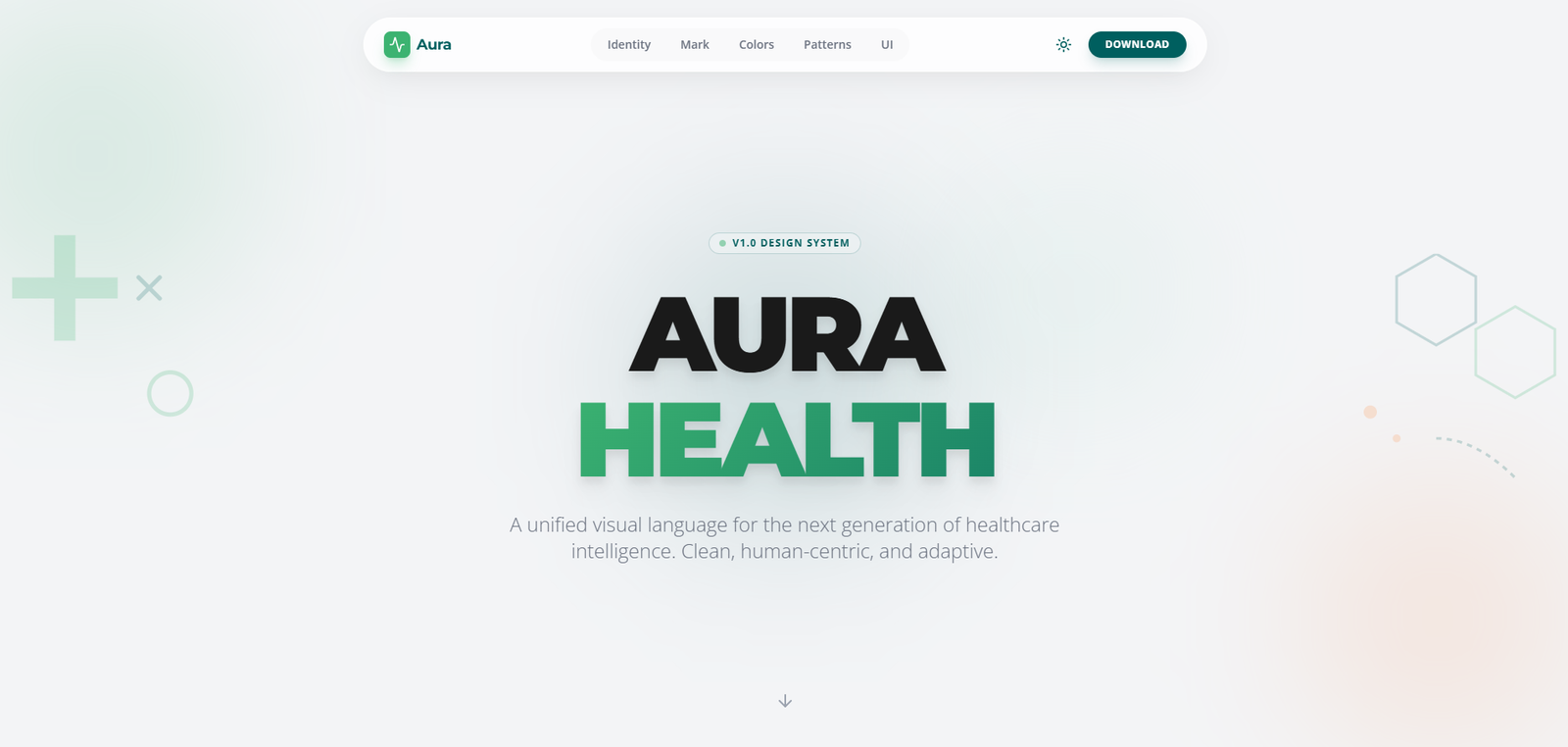
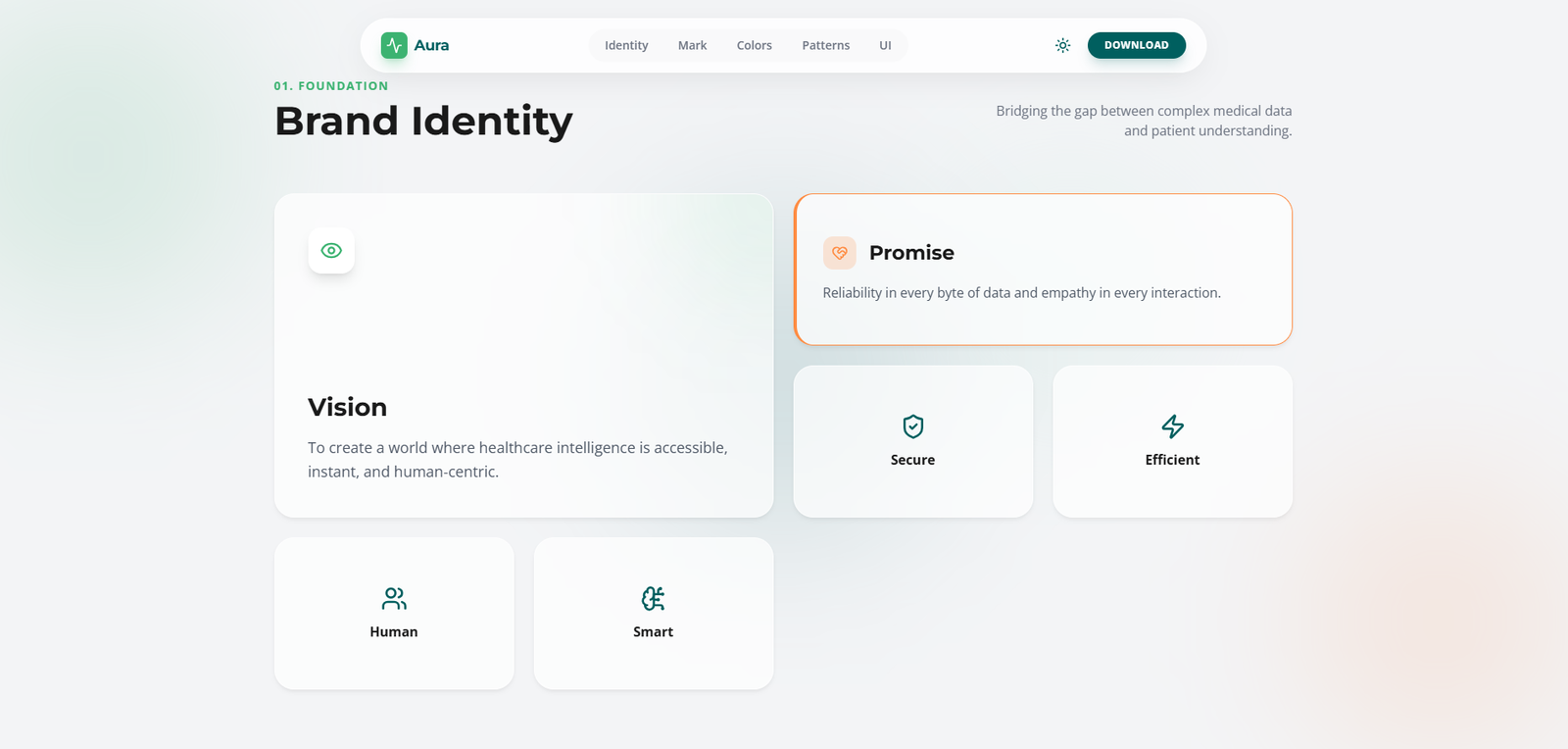
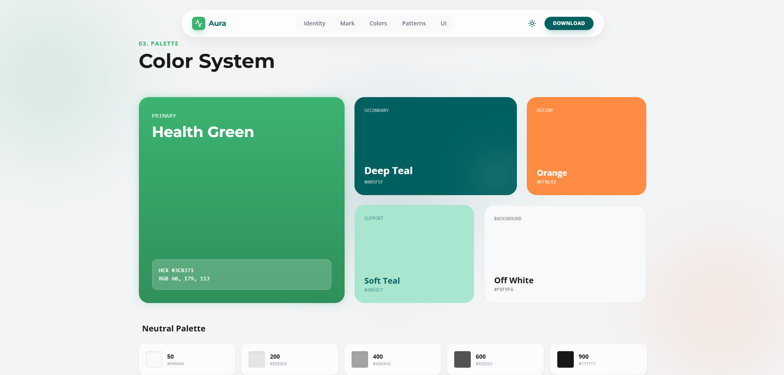
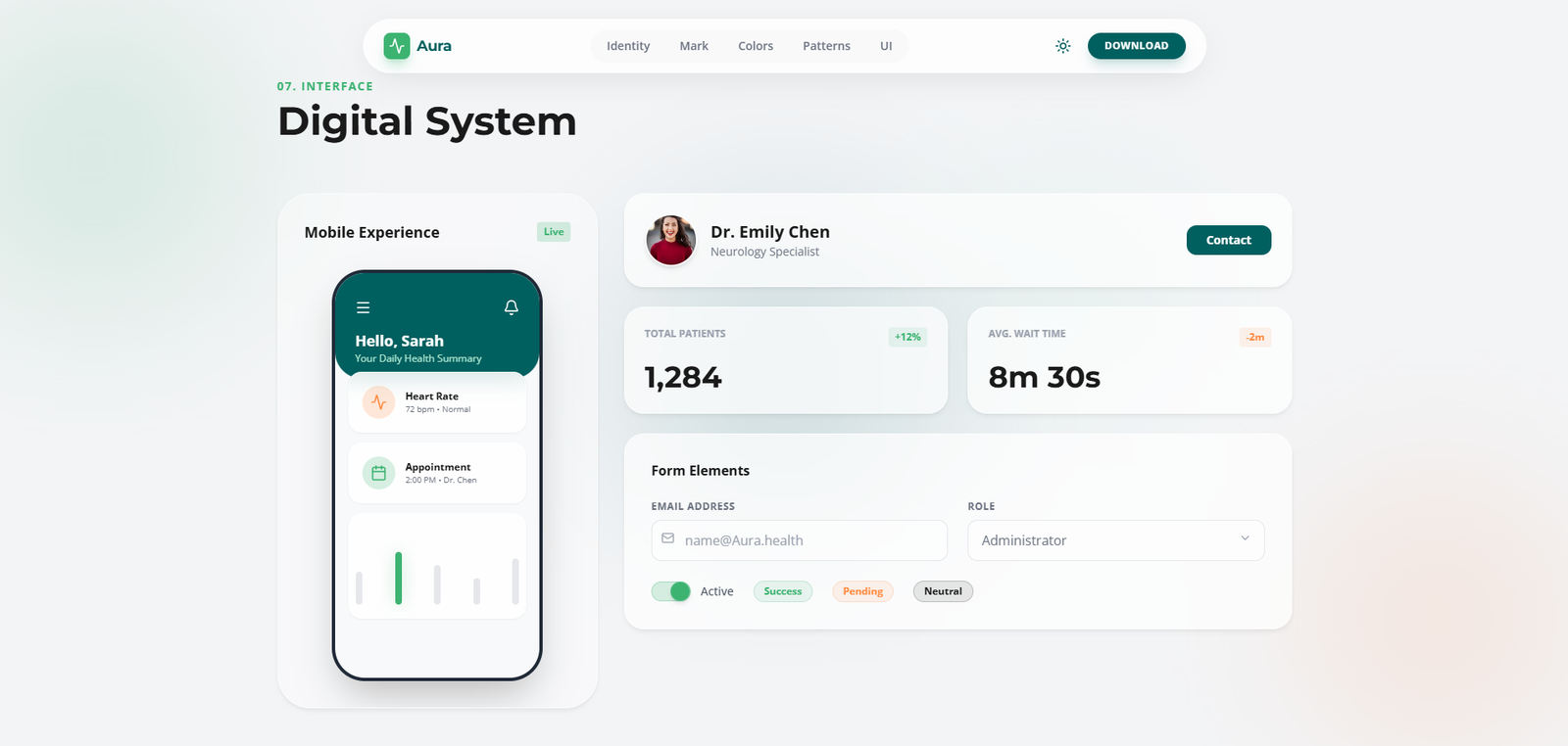
A complete brand identity system for Aura Health — spanning the pulse logomark, Health Green palette, Montserrat typography, UI patterns, and a full healthcare component library, built to communicate trust, vitality, and intelligence across every digital touchpoint.
01 — The Problem
Aura Health needed a cohesive brand identity that could scale across its healthcare intelligence platform, marketing surfaces, and clinical interfaces — while earning trust in a market where credibility is non-negotiable. The existing visual language was inconsistent across touchpoints.
Without documented standards, every new product surface was effectively designed from scratch — inconsistency accumulating silently until the brand felt fragmented, unreliable, and incapable of carrying the weight of healthcare data patients depend on.
The platform itself was genuinely sophisticated — the gap between what Aura Health delivered and how it visually presented itself was the core opportunity. A rigorous identity system wouldn't just solve consistency; it could actively elevate brand trust to match the intelligence of the product.
By establishing a complete 360° brand language — from the pulse logomark to UI pattern language — the system would give every team member creative confidence while maintaining absolute visual coherence across the entire healthcare experience.
Research Insights
02 — User Research
Three distinct users interact with Aura's brand system daily — each needing the guidelines to answer different questions quickly, accurately, and without ambiguity.
03 — Business Challenges
Without a living reference system, every team member makes micro-decisions that collectively erode brand cohesion — resulting in a fragmented identity that weakens market perception over time.
Design intent gets lost in translation between Figma and code. Without tokenised, developer-readable specs, every implementation requires rounds of correction that slow delivery and introduce inconsistencies.
Multiple logo variations, outdated colour codes, and conflicting typography specs living across shared drives, Slack threads, and email attachments made the "correct" version impossible to identify confidently.
As Aura expanded into new markets, the absence of a documented system made localisation and adaptation inconsistent — new touchpoints were built from memory rather than from a shared, authoritative source.
04 — Secondary Research
89% of companies report struggling to maintain brand consistency across all touchpoints — confirming that brand drift is a systemic industry challenge, not an Aura-specific problem.
Teams with interactive digital brand guidelines are 3× more efficient in asset production than teams relying on static PDF documents — validating the interactive guideline format.
Inconsistent branding costs companies 10–20% of potential revenue through weakened consumer trust, reduced recognition, and inability to command premium pricing in competitive markets.
05 — User Stories
06 — Competitor Analysis
| Feature | PDF Brand Book | Frontify | Brandfolder | Zeroheight | Aura Guidelines |
|---|---|---|---|---|---|
| Interactive Guidelines | ✕ | ✓ | ~ | ✓ | ✓ |
| Design Token Export | ✕ | ~ | ✕ | ✓ | ✓ |
| Asset Downloads | ✕ | ✓ | ✓ | ~ | ✓ |
| Version Control | ✕ | ✓ | ✓ | ~ | ✓ |
| Team Collaboration | ✕ | ✓ | ✓ | ✓ | ✓ |
| Embedded Figma Components | ✕ | ~ | ✕ | ✓ | ✓ |
07 — User Flow
08 — Toolkits
Tools and methods used throughout the brand design process — from initial audit and competitive mapping through to component library build and interactive guidelines delivery.
02 — Process
A six-phase process that moved from deep brand archaeology through competitive and aspirational mapping, to a fully codified design system — built to be owned, not just referenced, by every team.
03 — Design
Every element of Aura Health's identity was designed to feel inevitable — not assembled, but discovered. Health Green communicates vitality and growth; Deep Teal signals clinical trust and intelligence. The Montserrat + Open Sans pairing balances authority with human warmth. The system holds together under any pressure.
Aura Health — Brand Guidelines Document


Design Highlights
Design System
Every decision in the system — from the 8pt spacing grid to the easing curve on hover states — is grounded in the four brand pillars: Secure, Efficient, Human, Smart. Not arbitrary rules, but reasoned choices that accumulate into a coherent, trusted healthcare presence.
Health Green (#3CB371) anchors the brand — vital, trustworthy, and growth-oriented. Deep Teal provides clinical authority and depth. Warm Orange marks moments of care and urgency. Soft Teal adds supportive warmth throughout the healthcare interface.
Montserrat delivers confident, authoritative headings — the backbone of a healthcare brand that commands trust. Open Sans provides humanist, legible warmth for body text — making complex health information approachable and clear.
An 8pt spatial system governs all layout, padding, and component sizing. The grid creates the invisible rhythm that makes Aura's layouts feel orderly without being rigid — the foundation of perceived quality.
04 — Impact
The Aura brand system delivered measurable outcomes across every dimension it was designed to address — from design production velocity to brand consistency scores across all active touchpoints.