Marketing Website / Open Source

Web Design & UX Strategy

Making Complex
Feel Immediately
Understandable

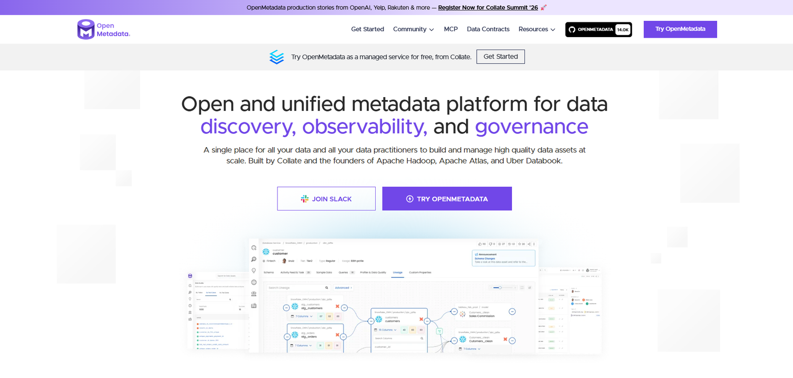
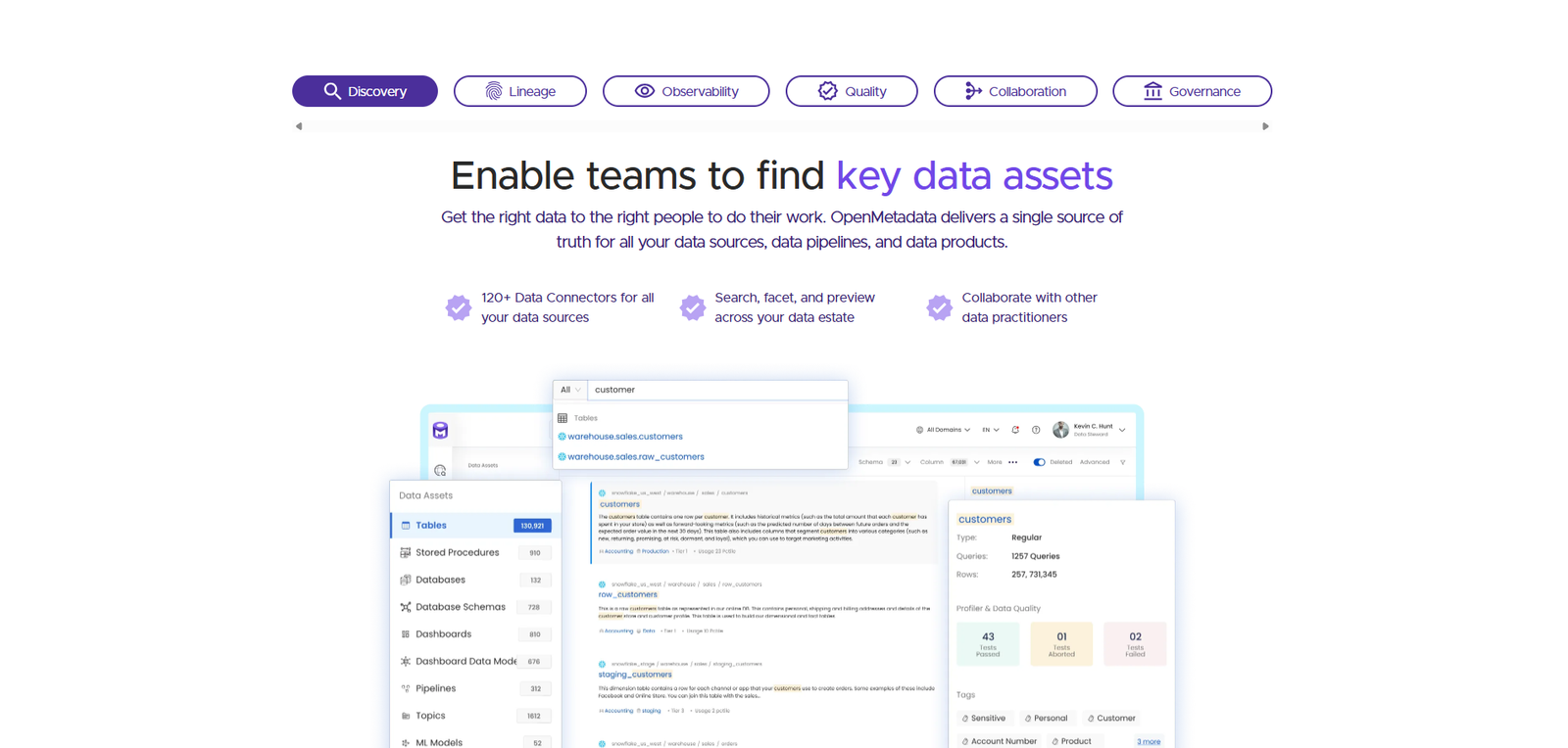
Designing open-metadata.org — the marketing face of an open-source platform built by the creators of Apache Hadoop, Apache Atlas, and Uber Databook. Translating Discovery, Lineage, Observability, Quality, Collaboration, and Governance into clear, conversion-driving storytelling for developers, data engineers, and enterprise buyers.

Role Web Designer & UX Strategist
Timeline 2023 – 2024
Platform Marketing Website
Category Open-Source / Developer
Bounce Rate ▼ 34%
−34%
after redesign
GitHub Stars ▲ 22%
7.2k
OpenMetadata website
Homepage Design Developer Experience Information Architecture Open Source Conversion Design Content Strategy Visual System Enterprise Positioning 13K+ Community Homepage Design Developer Experience Information Architecture Open Source Conversion Design Content Strategy Visual System Enterprise Positioning 13K+ Community
0 Enterprise Deployments
0 Data Connectors
0 Community Members
0 GitHub Stars
The Challenge

OpenMetadata — "an open and unified metadata platform for data discovery, observability, and governance" — is built by the creators of Apache Hadoop, Apache Atlas, and Uber Databook. With 3,000+ enterprise deployments and 11,000+ GitHub stars, it's one of the most credible open-source data platforms available. But the website failed to communicate any of that.

Visitors landed on a page dense with technical jargon that assumed prior knowledge. The site needed to serve developers evaluating OSS tooling, data engineers comparing 120+ connectors, and enterprise CTOs assessing governance — all from a single page hierarchy with minimal bounce.

My Contribution
Website Architecture Homepage Design Visual Language Content Strategy Conversion Optimization Developer Docs IA Component Library Responsive Design

Full ownership of the marketing website from audit through launch. Conducted audience research with community members, mapped user journeys per persona, and designed a homepage that led with outcomes — not features. The redesign surfaces the platform's six core pillars (Discovery, Lineage, Observability, Quality, Collaboration, Governance) with clarity for all three visitor types.


Research & Problem

Three audiences,
one front door

The old site treated everyone the same. A developer who just wanted the Docker quickstart and a VP of Data Architecture evaluating enterprise governance both landed on the same jargon-heavy homepage. Sessions were short. Conversions were low. Community growth was untapped.

01 — Audience Mismatch

Nobody Felt Spoken To

Session recordings showed three distinct visitor types with entirely different scroll patterns and drop-off points. Developers scrolled past the hero to find code. Enterprise visitors bounced at integrations lists. The site spoke to none of them directly.

02 — Feature-First Copy

Features Before Outcomes

Every section led with what OpenMetadata was, not what it did for you. "Metadata ingestion for 120+ connectors" means nothing to a data leader — "Understand every dataset your team has ever touched" starts a conversation. The narrative needed a complete inversion.

03 — Visual Hierarchy

Everything Competed for Attention

The previous design had no visual hierarchy — integration logos, code snippets, feature cards, and marketing copy all competed at the same visual weight. A clear typographic and spatial hierarchy was needed to guide visitors from awareness to intent.


02 — User Research

User Persona & Goals

Three distinct visitor types arrive at open-metadata.org with entirely different jobs-to-be-done. Each persona shaped the information architecture and content hierarchy of the redesigned site.

👤
Deepak Rao
Data Engineering Team Lead, 33
  • Evaluate OpenMetadata for team adoption
  • Understand integration depth with existing stack
  • Find documentation and quickstart guides quickly
  • Feature-focused homepage ignores use-case clarity
  • No comparison with paid alternatives like Collibra
🧑
Aarav Mehta
Open Source Contributor, 26
  • Find contribution guides and project architecture docs
  • Understand roadmap and community governance
  • Connect with other contributors and join community Slack
  • GitHub and Slack links buried below the fold
  • No clear community entry points on the homepage
👩
Sunita Iyer
Data Infrastructure Architect, 41
  • Benchmark OpenMetadata against Alation and Collibra
  • Understand self-hosted vs managed deployment options
  • Get indicative pricing before engaging sales
  • No self-hosted vs managed comparison on the site
  • Vague "enterprise" section without concrete specifics

03 — Business Challenges

Core Challenges

CHALLENGE 01
📄
Feature-First Copywriting

The site led with what OpenMetadata was — not what it did for you. "Metadata ingestion for 120+ connectors" communicates nothing to a data leader. Every section needed an outcome-first inversion.

CHALLENGE 02
🔗
Poor Conversion Path

Technical visitors had no clear path from interest to action. The journey from homepage to community join, sandbox trial, or docs was buried under competing calls-to-action at the same visual weight.

CHALLENGE 03
🏗️
Visual Hierarchy Failure

Integration logos, code snippets, feature cards, and marketing copy all competed at identical visual weight. Proof points — case studies, integrations, and community size — were not surfaced where visitors needed them.

CHALLENGE 04
⚖️
No Differentiation from Paid Alternatives

Enterprise visitors evaluating governance solutions needed a clear answer to "why OpenMetadata over Alation or Collibra?" The site made no attempt to answer this, losing high-intent enterprise visitors silently.


04 — Secondary Research

Market Insights

FINDING 01
42%
Bounce Before First Scroll

42% of homepage visitors were bouncing before scrolling past the hero — indicating the above-the-fold value proposition was failing to create immediate relevance for any of the three visitor types.

FINDING 02
73%
Multi-Page Technical Buyers

73% of technical buyers visit 5 or more pages before initiating contact with an open-source project. A site with poor internal linking and no guided journey was failing to retain this high-intent segment across their research cycle.

FINDING 03
Top Exit
Integrations as Drop-Off Point

The integrations page was the top exit point — visitors arrived expecting a searchable, filterable catalog and found a flat list. Redesigning integrations as a trust-signal catalog became a primary design priority.


05 — User Stories

What Users Need

As a... I want to... So that... Priority
Developer Evaluating Find a Docker quickstart and sandbox link immediately I can trial the platform without a sales conversation High
Data Engineering Team Lead See a clear comparison of integration depth vs competitors I can make a confident recommendation to my team High
Open Source Contributor Find contribution guides and community Slack in one click I can start contributing without navigating docs blindly High
Enterprise Architect Understand self-hosted vs managed deployment tradeoffs clearly I can assess fit for our compliance and infrastructure requirements High
Community Member See the project's momentum and community size prominently I feel confident recommending OpenMetadata to my peers Medium

06 — Competitor Analysis

Market Landscape

Feature Alation Collibra Atlan DataHub (OSS) OpenMetadata
Clear Value Proposition ~
Integration Catalog ~ ~ ~
Community Entry Point ~
Self-hosted vs Cloud Comparison ~
Use-case Navigation
Case Studies
Pricing Transparency ~

07 — User Flow

The Journey

STEP 01
Land on Homepage
Visitor arrives via search, referral, or GitHub. Hero immediately frames OpenMetadata around their outcome, not the product's feature list.
STEP 02
Understand the Product
The hero section leads with "your data team deserves to know their data" — anchoring value before revealing mechanism. Each persona finds their natural entry point.
STEP 03
Explore Features
Outcome-led feature sections guide visitors through discovery, lineage, governance, and quality — with persona-specific depth cues for developers and enterprise buyers.
STEP 04
Check Integrations
Searchable, filterable integration catalog with 120+ connectors spanning databases, cloud storage, pipelines, dashboards, and ML platforms — redesigned from a raw list into a trust signal that communicates breadth and community contribution.
STEP 05
Contact / Join Community
Clear forked CTAs route developers to sandbox trial and contributors to community Slack, while enterprise visitors reach a guided demo request path.

08 — Toolkits

Tools & Workflow

Tools and methods used throughout the OpenMetadata website design process — from discovery and analytics to design and delivery.

🎨FigmaUI Design
🗺️FigJamIA & Journey Mapping
🔥HotjarHeatmaps & Recordings
📊Google AnalyticsTraffic & Funnel Data
📝NotionResearch & Documentation

Design Process

From audit to launch

A five-phase process anchored in audience research and conversion thinking — treating the website as a product with measurable outcomes, not a brochure to be designed and forgotten.

01
Audit
Analytics review, heatmaps, session recordings, and community survey to map existing pain points.
02
Persona Mapping
Defined three distinct visitor personas — OSS Developer, Data Engineer, and Enterprise Buyer — each with unique jobs-to-be-done.
03
Content Architecture
Restructured the site IA around outcomes: What problem do you have? → How OpenMetadata solves it → Proof → Next step.
04
Visual Design
Built a technical-but-approachable visual language: deep dark backgrounds, data-viz-inspired accents, and clean typography that signals reliability.
05
Launch & Iterate
Shipped with analytics instrumented from day one. Iterated homepage hero copy 3 times based on A/B results within 60 days of launch.

Website Design

The Homepage

A website mockup representing the redesigned open-metadata.org homepage — built to lead with outcomes, guide distinct personas, and drive developer adoption and enterprise inquiry in parallel.

open-metadata.org
OpenMetadata Website — Main View

OpenMetadata — Redesigned Marketing Website

OpenMetadata Website — Screen 2
OpenMetadata Website — Screen 3
OpenMetadata Website — Screen 4
Persona-Layered Homepage
The homepage hierarchy is designed so each persona finds their natural entry point — a "Get Started" developer CTA above the fold, an enterprise trust strip with logos mid-page, and a governance features deep-dive for technical evaluators below.
Data-Viz Visual Language
The design system borrows from data visualization aesthetics — node graphs, lineage diagrams, and pipeline flows — as decorative elements that reinforce what the platform does while giving the site a signature visual identity distinct from generic SaaS templates.
Outcomes-First Copy Architecture
Every section was rewritten to lead with the outcome the user cares about, then reveal the mechanism. "Know where every dataset came from" precedes any mention of "lineage graph". This shifted the conversation from feature-push to value-pull across all page types.
Integrations as Social Proof
The 120+ connectors page was redesigned from a raw list into a searchable, filterable catalog with category groupings — Snowflake, BigQuery, Airflow, dbt, Tableau, Looker, Kafka, and more. Each integration tile communicates breadth and community contribution depth, turning a feature list into a trust signal.

Measured Impact

From 3K+ deployments
to 11K+ GitHub stars

0
Bounce Rate Down
Reduction in homepage bounce rate within 90 days of redesign launch
0
More Sandbox Signups
3x increase in free sandbox trial activations from homepage traffic
0
Longer Sessions
Average session duration increased as persona-targeted content held visitors deeper in the funnel
0
Community Members
Active open-source community members across Slack, GitHub, and 430+ code contributors — supported by clearer community entry points on the site

The most powerful thing about this project was realising that a marketing website is a product — it has users, jobs-to-be-done, conversion funnels, and measurable outcomes. Treating it that way changed everything: we stopped designing pages and started designing journeys.

Rupesh Chavan — Web Designer & UX Strategist